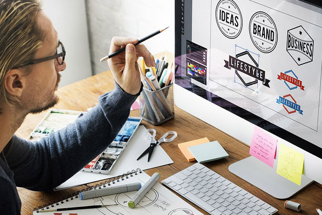
Your logo could be the first way that your customer interacts with your brand, whether online (in a Facebook profile or web page header) or offline (on a product package or shop front). So it makes sense to learn from the best and ensure you’re making a great first impression.
Let the visual echo the functional
Some of the most memorable logos suggest what the company does – whether overtly or subtly.
For example, you may not notice the arrow in the FedEx logo at first glance, but it’s there. It gives the impression of directness, movement and accuracy – all useful connections to make when you’re a package delivery company.
![]()
Make it scale
If your logo is too complex, then it may look like something else entirely when scaled down. You’d probably recognise the McDonald’s Golden Arches whether they were sixty-feet or sixty-millimetres tall. The key is to avoid any details that don’t scale to a small level (such as smaller fonts beneath the logo or detailed images such as faces).
![]()
Don’t rely on colour alone
If colour is the only element that tells a story in your logo, then you’ll struggle when the logo is reprinted in black and white or another colour altogether. The shapes and style should carry the message, with the colour backing it up. Using the McDonald’s examples again, even without the gold, you recognise the arches.
A tip when designing: try and create the logo in black and white, then add colour at a later stage. (Call our London web design team for more tips and help.)
Don’t be dull
As the recent furore surrounding the redesigned GAP logo testifies, a dull logo doesn’t do your business any favours. Try and stand out with a logo that couldn’t possibly be mistaken for anything, or anyone, else. Helvetica text with a blue square doesn’t really scream “originality”.
![]()
If you want us to work on your logo, or need any other professional website design services, get in touch.