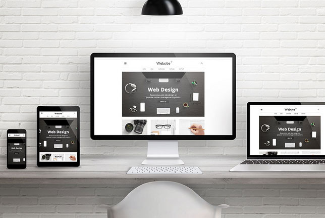
Responsive web design is a new web design strategy and technology being developed to find the best ways in which to display websites on all screen types and devices. It tends to start out with consolidating website elements such as CSS3, fluid grids, media queries and flexible images etc to enable web pages to display on the available devices or platforms.
With users accessing the Internet from a plethora of devices such as desktops, smartphones, game consoles and tablets with varying screen resolution, size and orientations for each, the most logical solution is one website for every screen.
The big question is when to use it? There are a few key elements to should consider before going down the responsive road such as Performance, Browser Support, Content and of course Website Vs. Web App. The fact is when considering RWD it’s important to consider all the facts as it may not be for everyone. That said, at the very least a web experience should be fully optimised for mobile especially given that tablet sales are expected to exceed 100 million this year.